Navigation
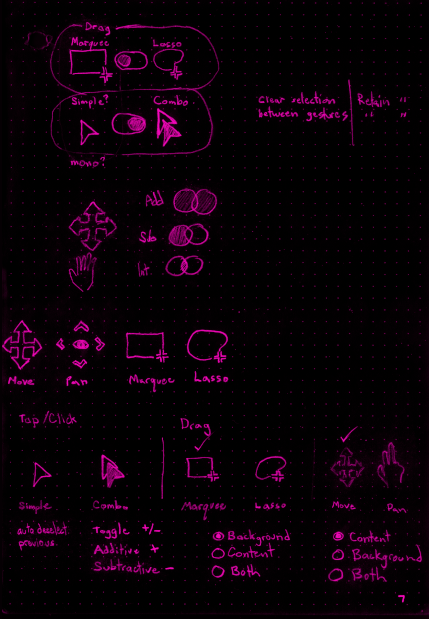
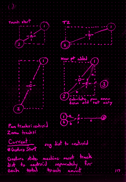
By far, the most common interaction in an infinite canvas application is navigation: panning and zooming. Established workspaces that are referenced much more often than they are edited may be thought of as effectively read-only. In this case, navigation events are the only events. This realization was an important first step in establishing the correct navigation tooling. It was vital to allow panning, zooming, and basic object selection without requiring any tool change, regardless of input device (mouse, trackpad, touch-screen).
Infinite canvas applications also need to support automatic navigation that occurs as a side-effect of other activity. Examples include:
- panning when an object is moved to the edge of the screen
- animating a view transition when following an in-workspace hyperlink
- following another user (who may be using a different screen resolution or orientation).


Selection
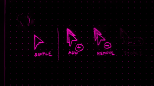
In many applications, object selection is synonymous with a click. Touch-screen devices map “tap” events to “click” handlers making this initial simplification very straightforward. However, once an application needs to support multi-selection (multiple, simultaneously selected objects), the interaction model grows more complex. There are widely established patterns across the ecosystem: [shift]-click to multi-select, drag to marquee, etc. Despite the shift towards touch-screens, interaction patterns to replace common keyboard modifiers are inconsistent at best and nonexistent at worst.
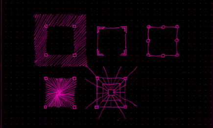
For mouse and trackpad, we designed hover and/or custom cursors to aid feature discoverability. I eventually redesigned the core hitzone definitions.


Undo
The undo stack typically does not include navigation or selection changes as undo-able actions. However, it’s important to adjust the viewport when undoing a change that would otherwise be off-screen and to restore the relevant selection state as part of undo actions.