Storybook
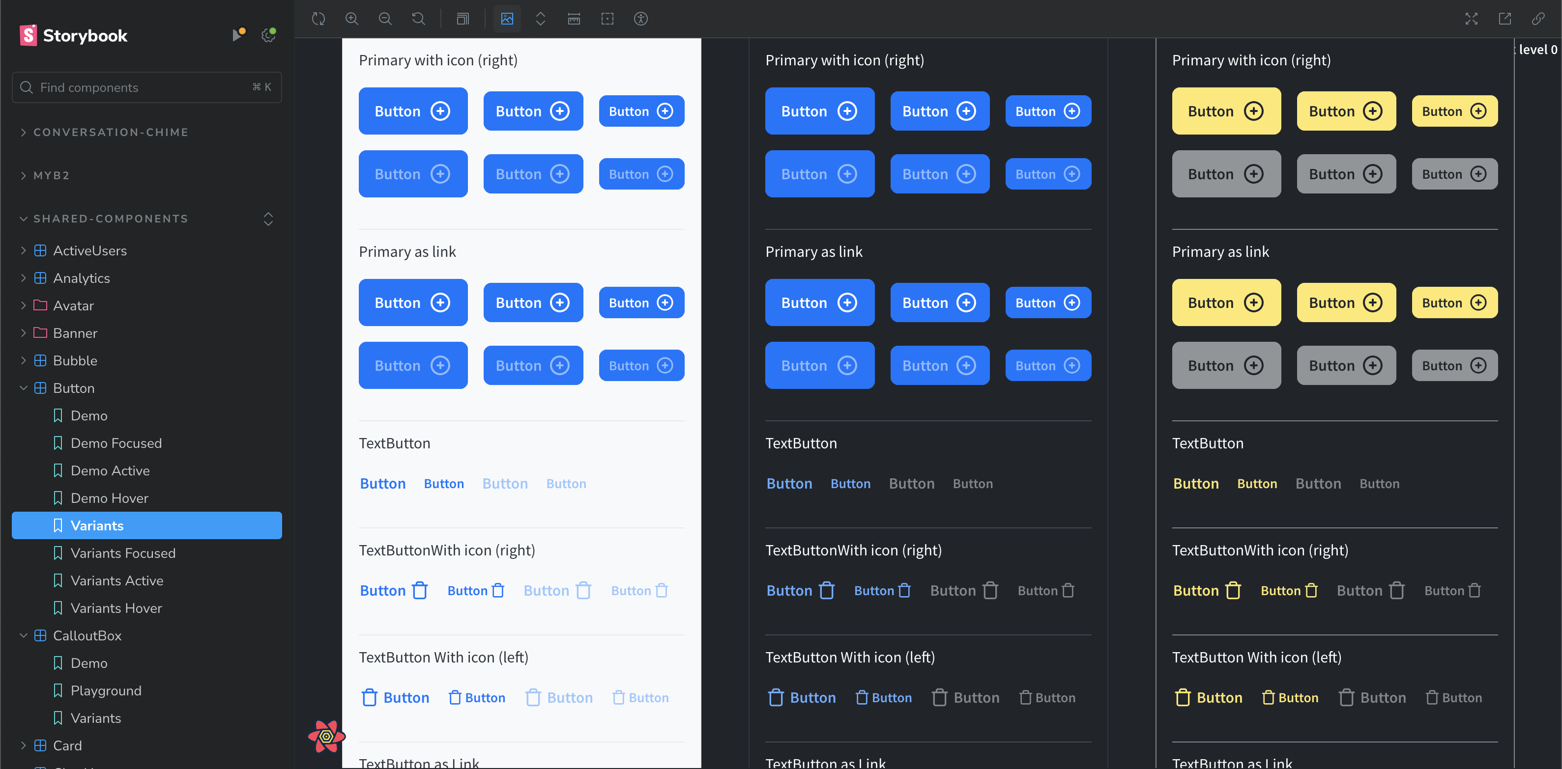
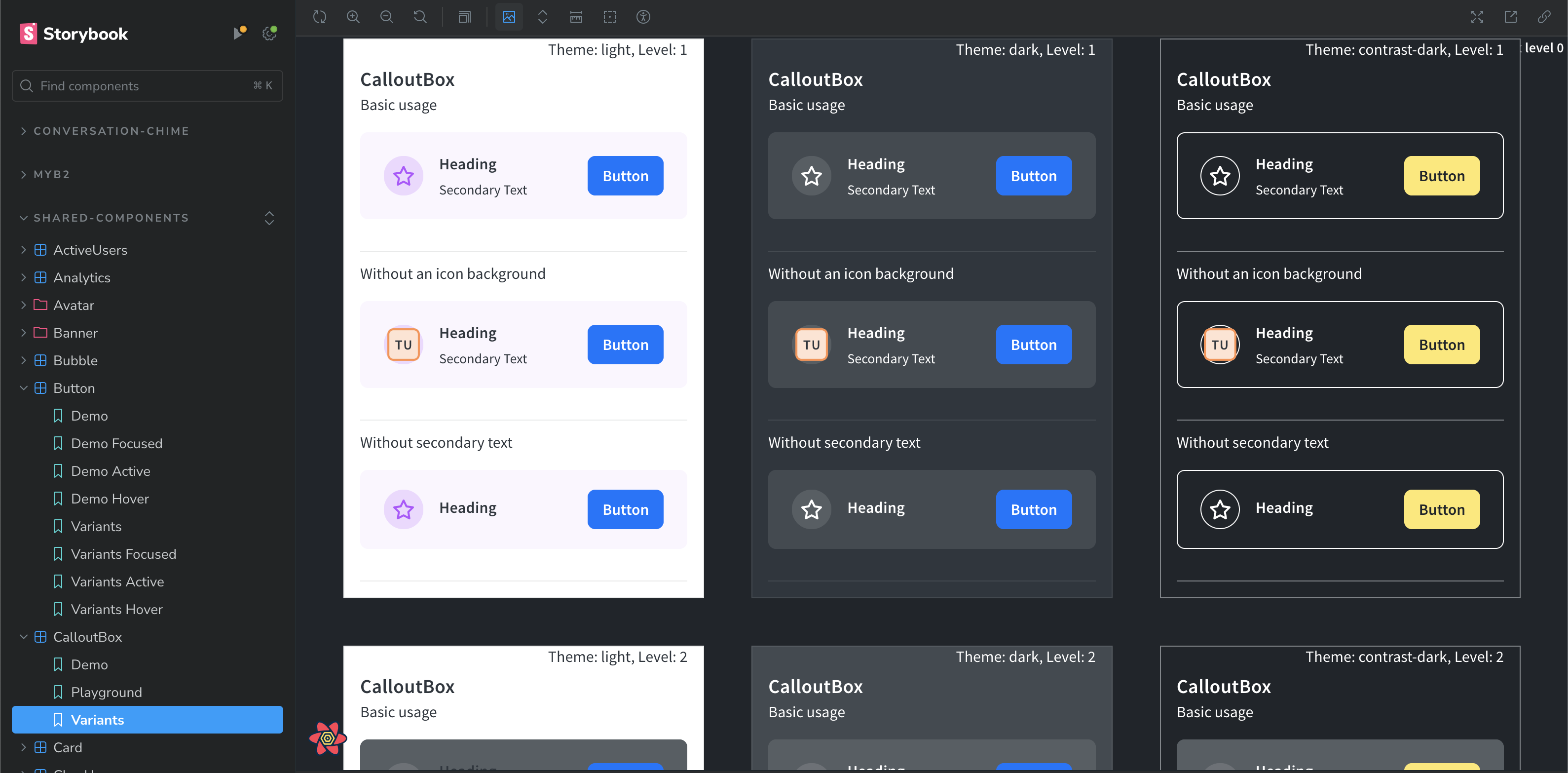
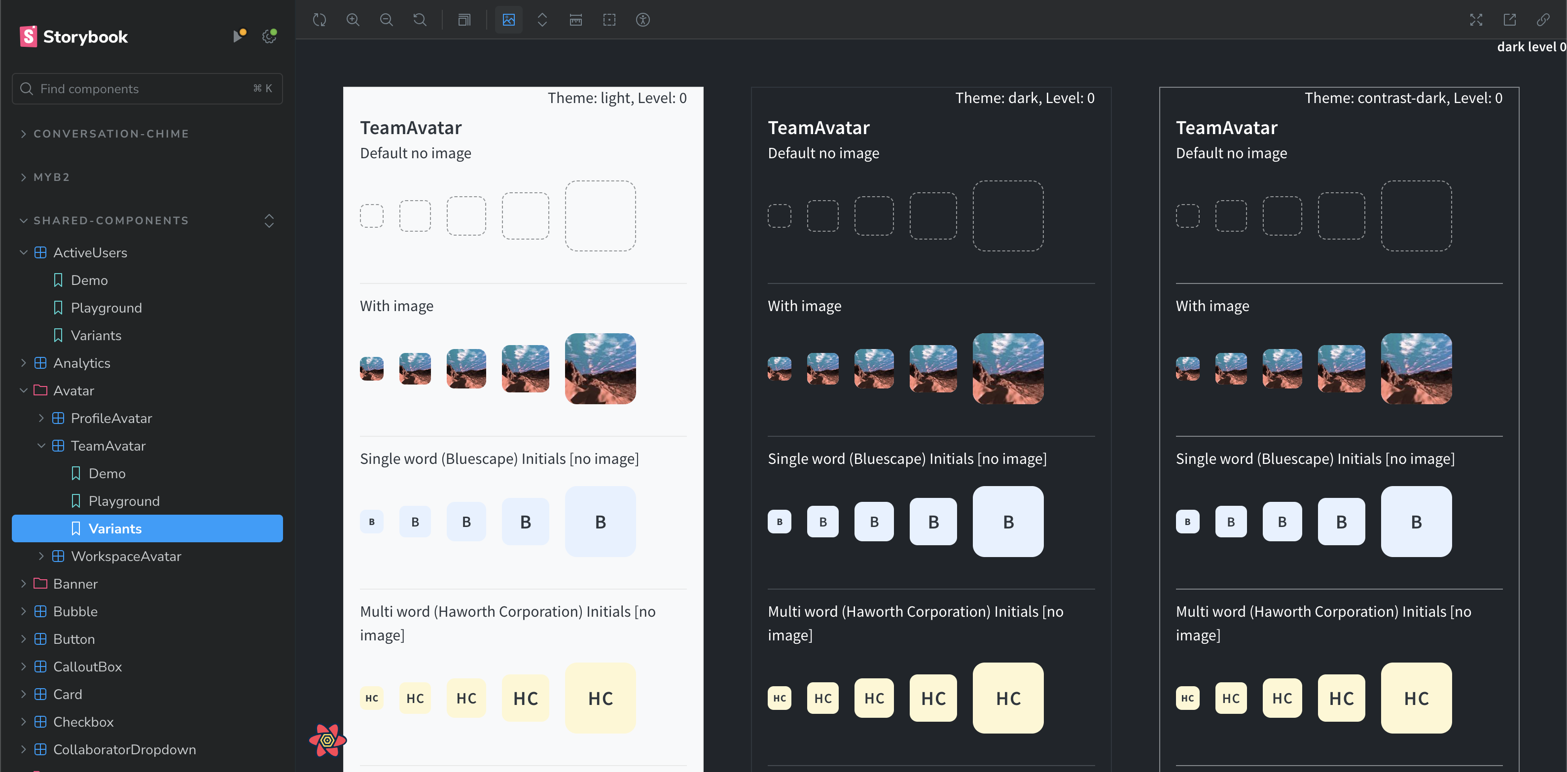
Bluescape supports three themes, each defining colors at three light-levels, used to create a distinction of depth between the workspace modal panels and other overlays.
I spearheaded the use of Storybook to keep track of a growing shared component library. Developers can browse available components and their states, plus access example code and documentation all within Storybook. My custom visual regression script then ran tests against huge combinations of components, component states, screen-sizes, and color themes--this vastly increased developer confidence and reduced the burden on QA.
I was also able to contribute to an open source plugin bringing unit tests alongside each component.