Typography
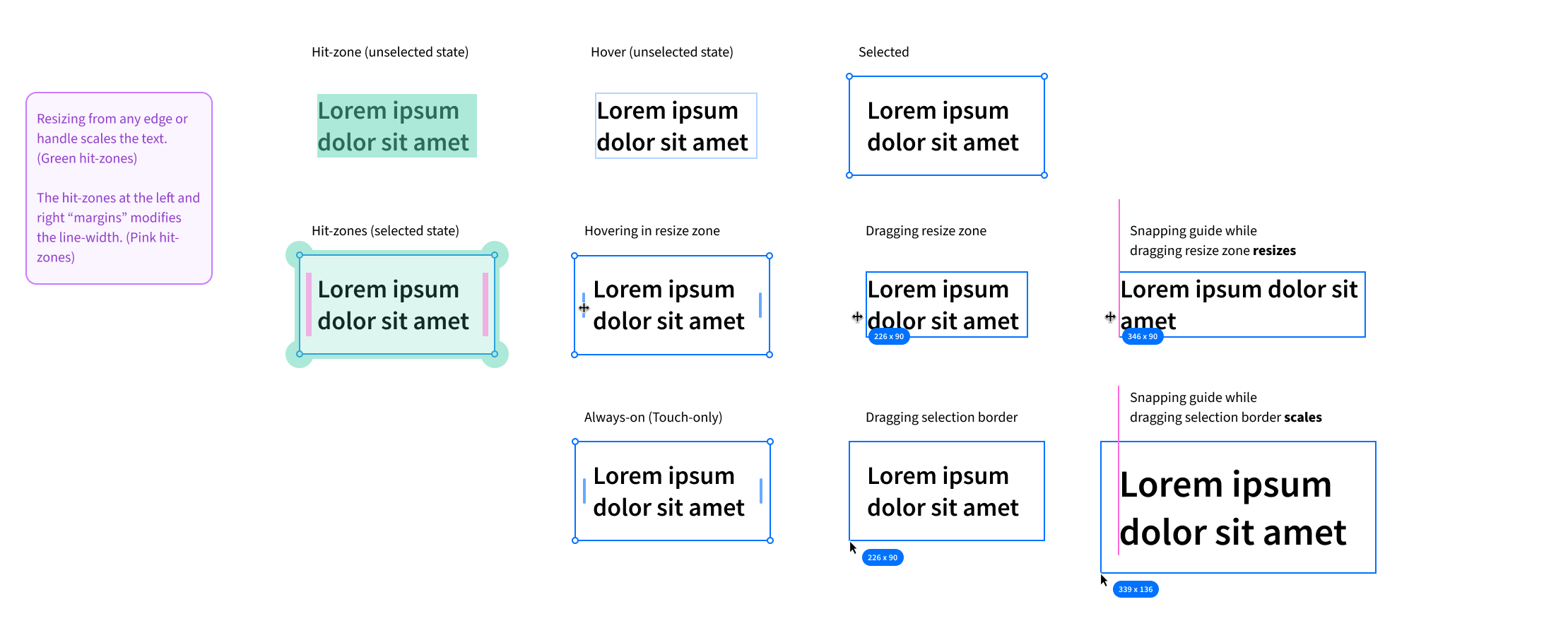
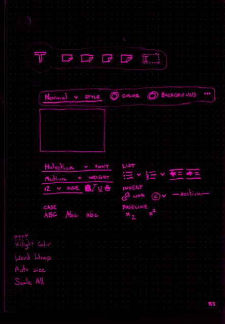
Text is the most critical component of most websites and applications, yet most designers have a poor grasp of legibility concerns. Figjam, Miro, Mural, LucidCharts, and Whimsical all provide basic text objects, and most include flawed or questionable choices. Text should never spill outside its container. Text should never be clipped or scroll in these contexts–it’s an infinite canvas; use it! Borders should not crowd (or worse, overlap) the text.
Determining a good default text size is usually the first legibility concern, but it shouldn’t be the last. Too few or too many characters per line will cause issues, as will too small or too large a line-height. To a lesser extent, the margin size also comes into play.
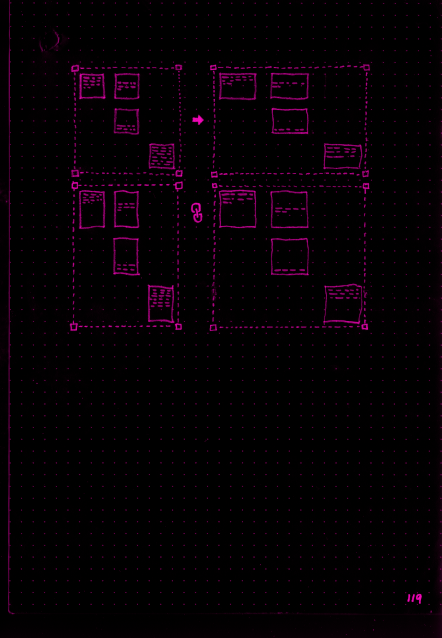
Users are unlikely to know what these terms mean, let alone have the experience to set them appropriately by hand. Where possible, we want a system that handles these details for us in a reasonable way. A large part of my work at Bluescape involved driving organizational alignment for text tool improvements. I developed functions for determining line-height and padding based on the current object’s width and font-size. This approach has several important ramifications: 1) text block parameters can be kept within acceptable ranges because knowing the object width and font size roughly tells you the number of characters per line. 2) this approach allows objects to be scaled optically without recomputing line break positions.
