Color and Contrast
Bluescape offers light and dark workspace backgrounds and adjusts its default text colors accordingly. This choice is mostly a matter of user preference, however we quickly became aware how uncomfortable it is to give a presentation while standing in front of a blindingly-bright touchscreen.
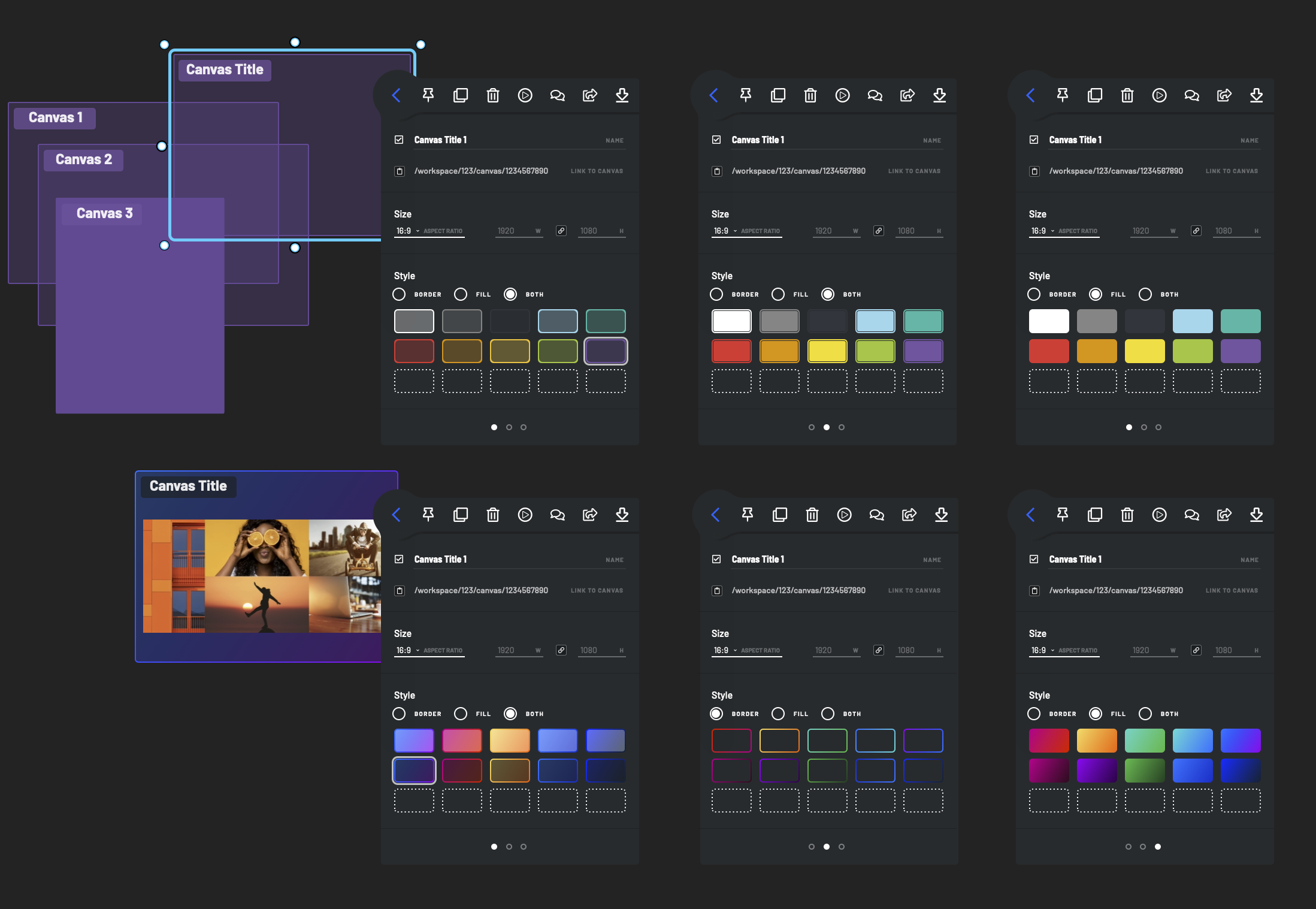
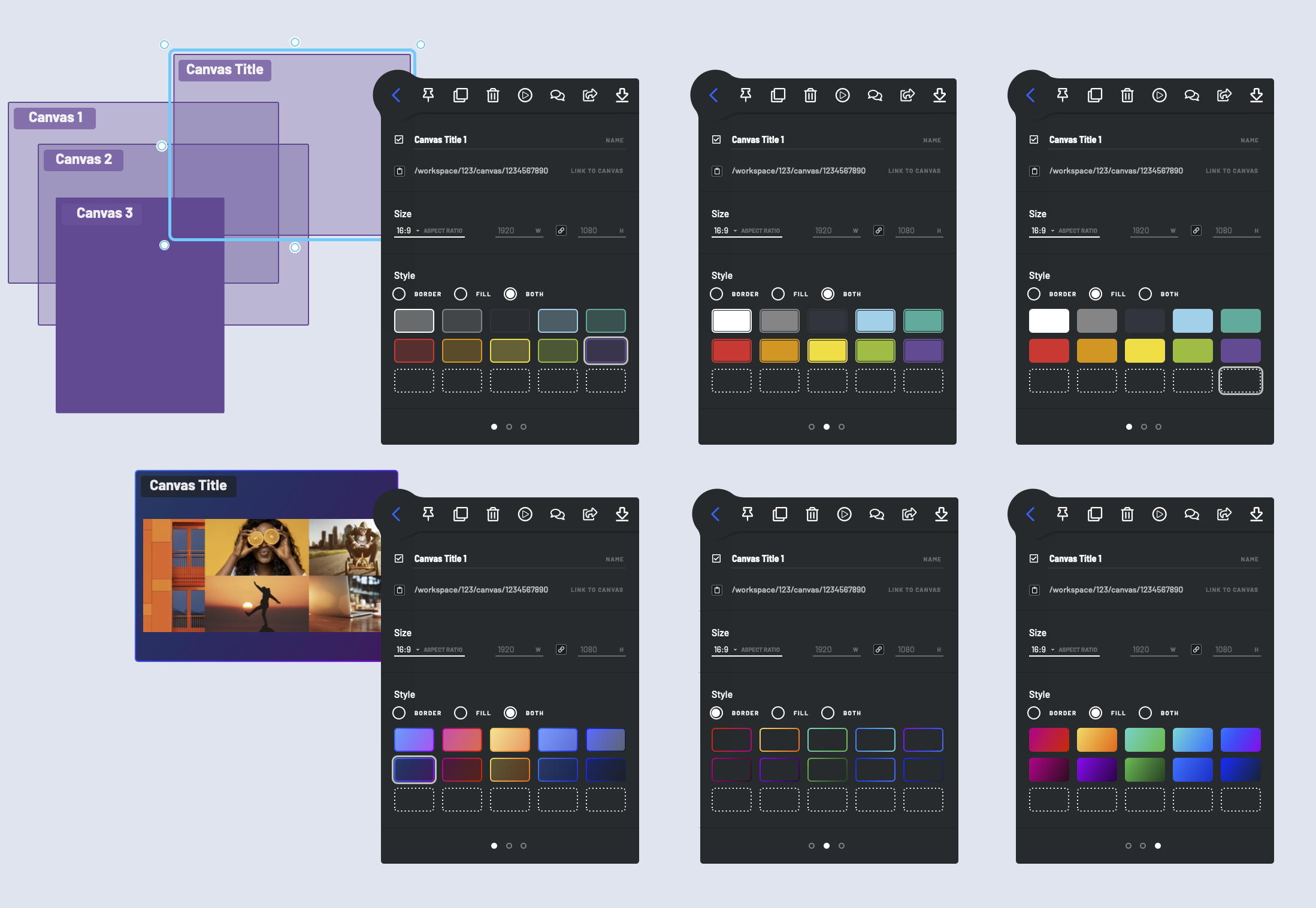
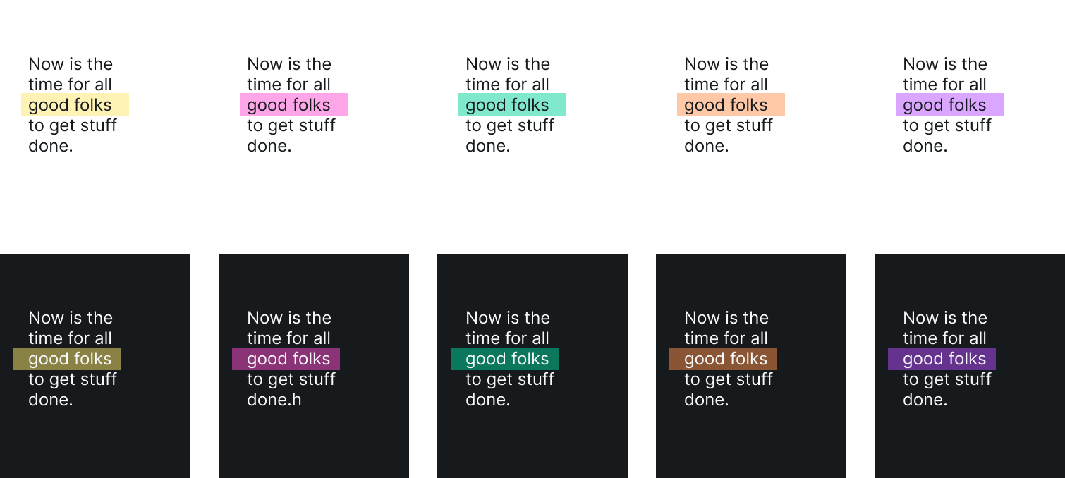
Web-browsers now widely support several new color calculation functions as well as OS preference for “dark mode” and and high contrast. Bluescape’s design system includes a color palette as well as extensive rules governing button and panel background colors at each “layer” of the UI. For example, a popup dialog appears slightly lighter than the base UI, creating the illusion of being closer to the user and on top of other elements. We used Storybook to help manage the complexity of hundreds of combinations of theme, component state, and UI depth. This also provides a great opportunity to display a warning for any color combination that doesn’t pass WCAG contrast thresholds. For text-on-shape objects, I developed an algorithm for choosing the default text color based on 1) the current workspace theme (light or dark) 2) the previously selected shape background color (if any) 3) the previously selected text color (if any). We also explored adding a dynamic “automatic” color to our palette. Text set in this “color” would automatically set itself to black or white–whichever provided the highest contrast in the context of the current background.